The data set we build from
Every instruction below refers to one worked example, so you can reproduce it cell for cell. Ten rows, three columns, in $m. Put the headers in row 3 and the first step in row 4; the row numbers in the formulas later assume exactly that.
| Row | A · Step | B · Value | C · Type |
|---|---|---|---|
| 4 | Opening revenue | 412.0 | T |
| 5 | New customers | 58.4 | |
| 6 | Expansion | 23.9 | |
| 7 | Price | 11.2 | |
| 8 | Churn | −34.6 | |
| 9 | Downgrades | −12.1 | |
| 10 | Organic revenue | 458.8 | T |
| 11 | FX | −9.3 | |
| 12 | Disposals | −18.5 | |
| 13 | Closing revenue | 431.0 | T |
Two rules govern this table and they cause most of the chart problems people hit later. Movement rows carry a signed delta; a decrease is typed as a negative number, never as a positive number you intend to colour red. Level rows carry the level itself, not a delta, and they must actually tie: 412.0 + 58.4 + 23.9 + 11.2 − 34.6 − 12.1 = 458.8, and 458.8 − 9.3 − 18.5 = 431.0. Build the level rows as live formulas (=B4+SUM(B5:B9) in B10, =B10+SUM(B11:B12) in B13) so that the moment someone edits a driver, a mistyped subtotal cannot survive.
Almost every "my waterfall looks wrong" question traces back to one of those two rules being broken; usually a decrease entered as a positive, which the chart then draws climbing upward.
Anchor
Start from a stated baseline.
Explain
Give each driver a signed value.
Reconcile
End exactly where the numbers do.
The template collection
Six ways to tell the story.
Editable PowerPoint slides and downloadable PDF previews. Choose a layout, then make it your own.
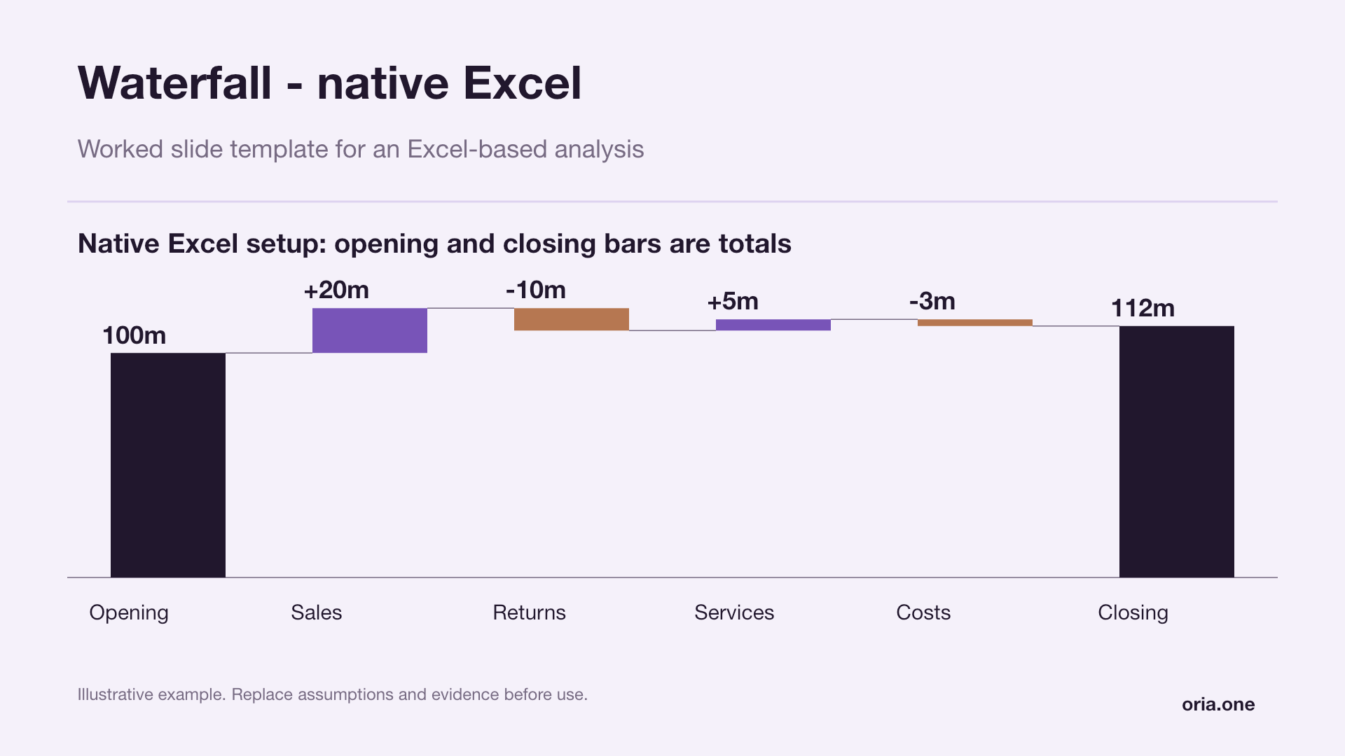 Waterfall - native ExcelLilac editorial
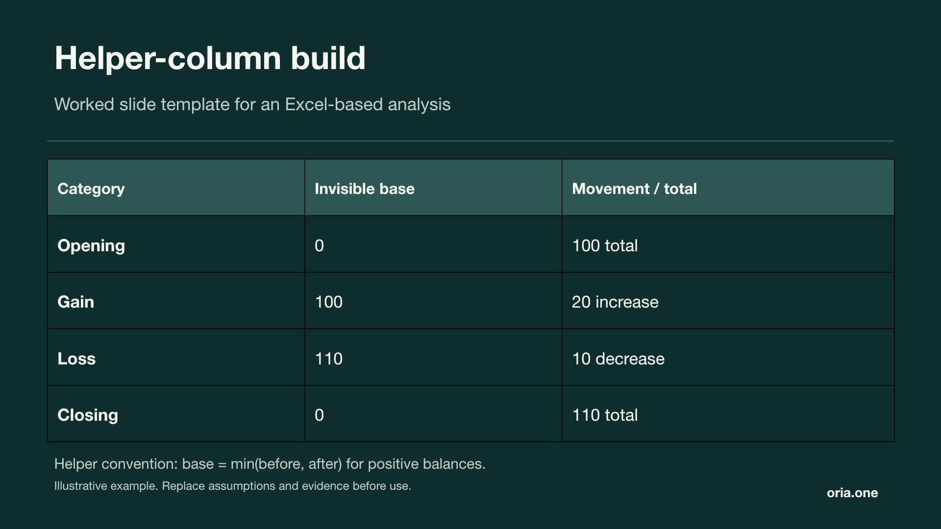 Helper-column buildMidnight mint
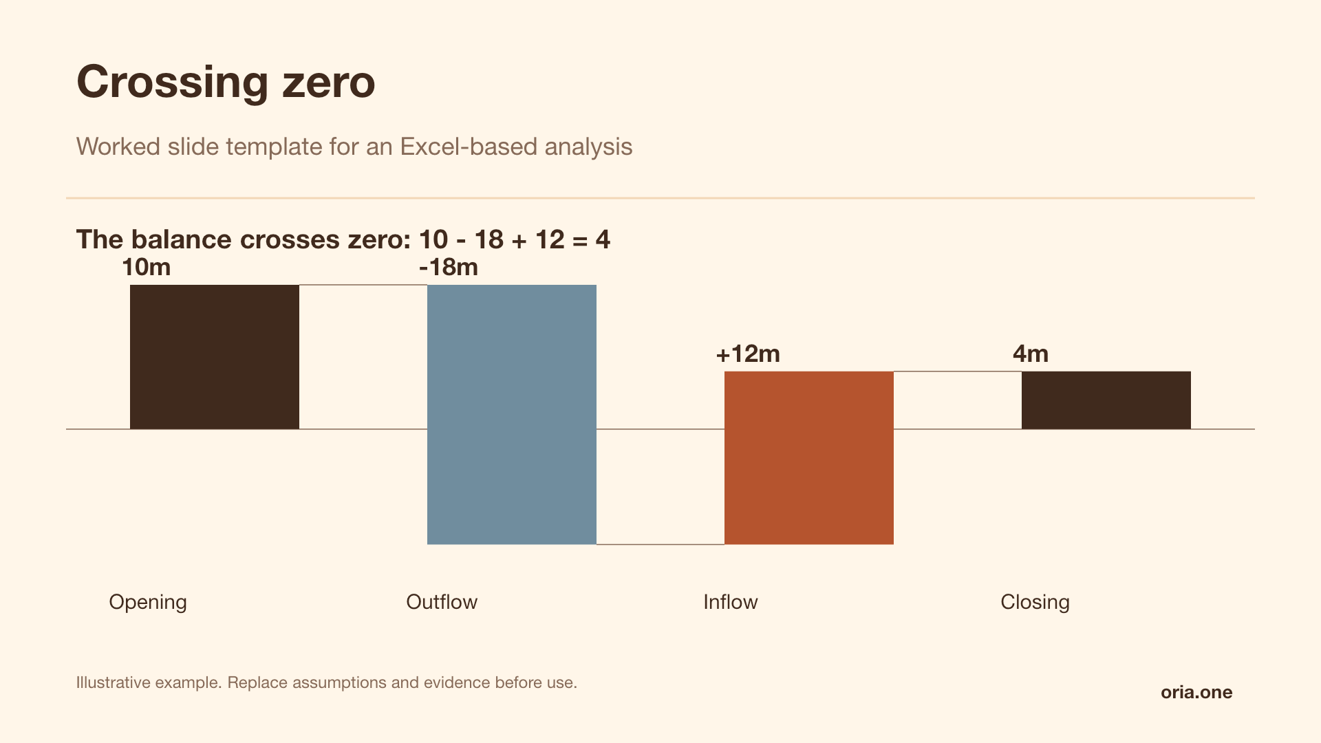 Crossing zeroWarm studio
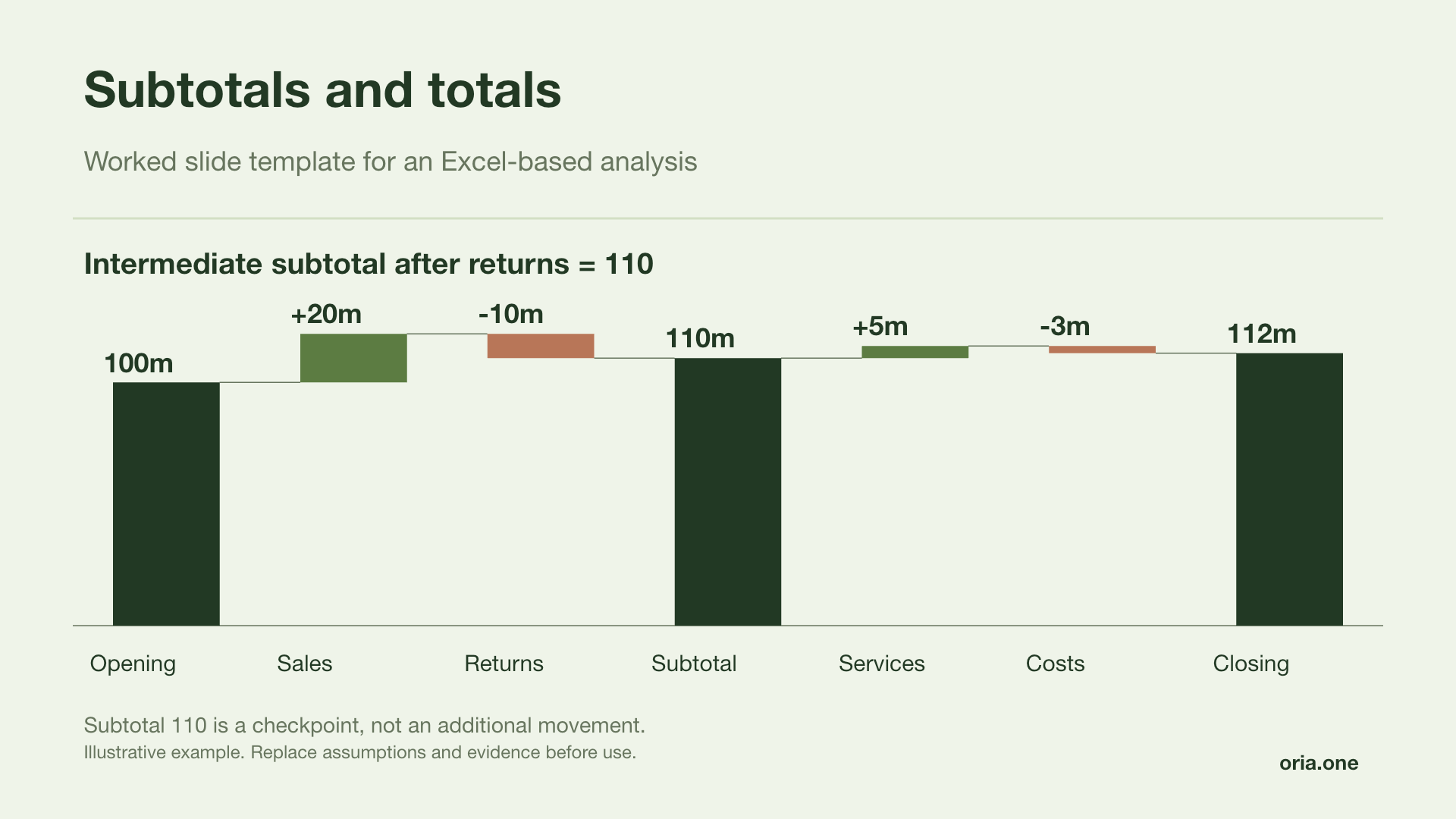 Subtotals and totalsForest report
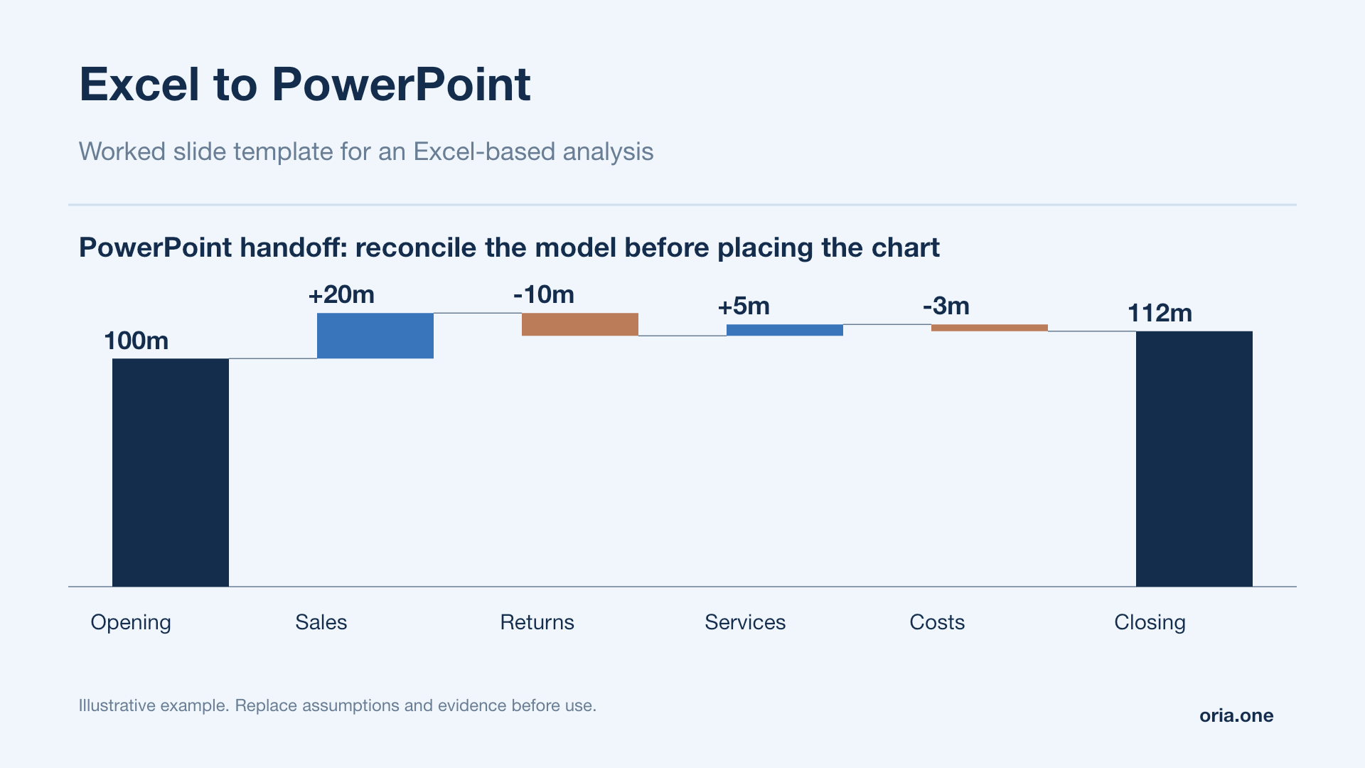 Excel to PowerPointBlue analysis
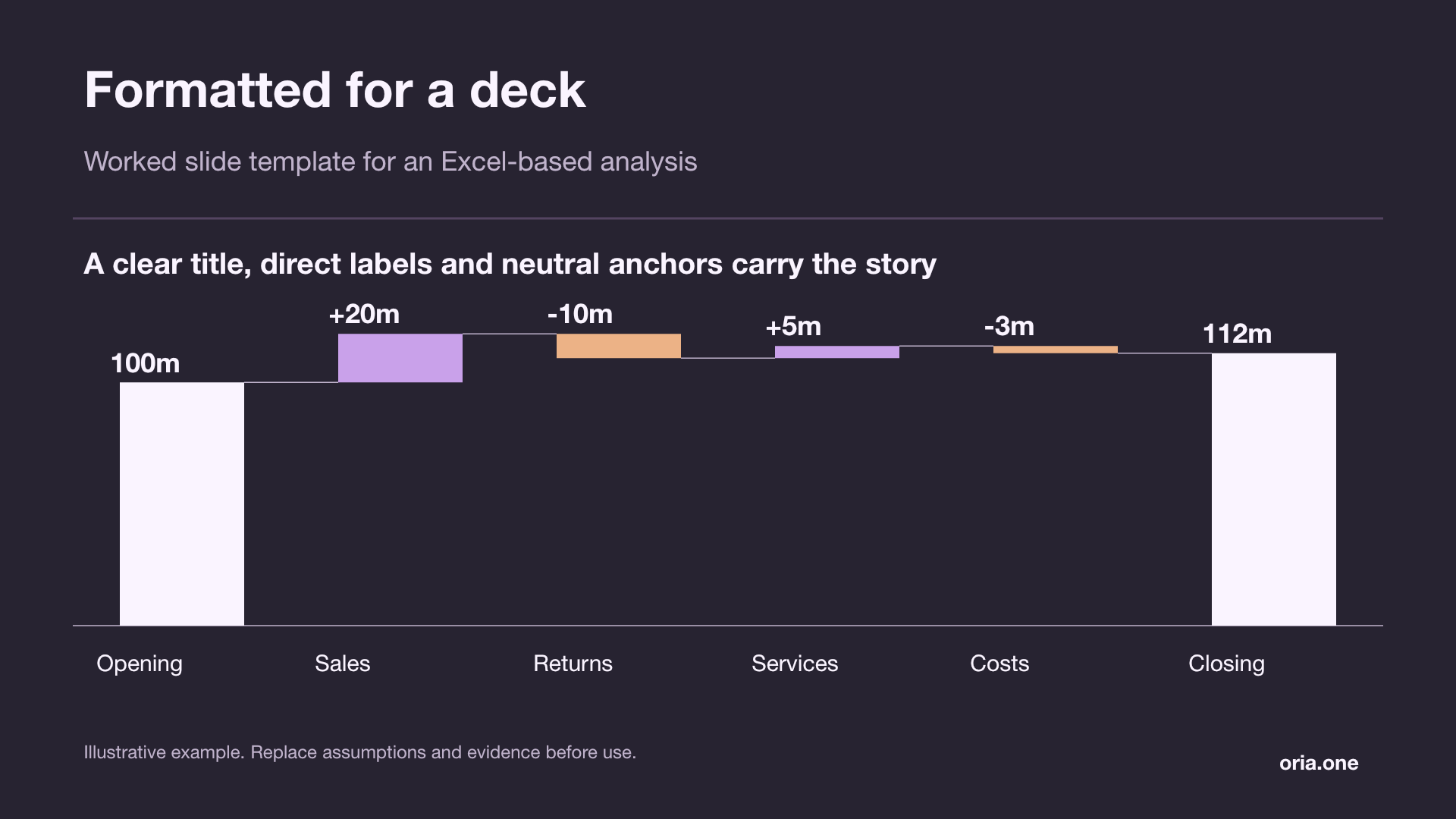 Formatted for a deckGraphite orchid
Illustrative examples. All slide text and chart shapes are editable; replace sample values with your own analysis.
The native chart type, step by step
Excel has shipped a real waterfall chart type since Excel 2016. Microsoft lists it for Excel for Microsoft 365, Excel 2024, 2021, 2019 and 2016 on Windows, for Excel for Microsoft 365 for Mac; the perpetual Mac releases are not on that list; and for Excel on iPad and iPhone. The Mac build only got full format-pane control over the newer chart types in version 16.21, January 2019. Excel 2013 and earlier do not have it; skip ahead two sections.
- Select
A3:B13; labels and values only. Do not include column C. The type flag is metadata for you, not a data series; include it and Excel plots it as a second series. - Insert tab → Charts group → the Insert Waterfall, Funnel, Stock, Surface or Radar chart icon → Waterfall. Recommended Charts → All Charts → Waterfall reaches the same place.
- The chart appears with every bar floating, coloured by sign, with a legend showing Increase, Decrease and Total, and with connector lines already on.
- Fix the totals; the next section. Nothing else matters until that is done.
Two things that trip people up at this step. If your range is a formatted Excel Table, its Total Row does not reach the chart; Microsoft confirmed this as an Excel 2016 bug, never published a fix, and has since retired the article, so its status in current builds is undocumented. Its own workaround was Convert to Range; the better habit is to put subtotals in the table body as ordinary formula rows, exactly as row 10 above does. And if you selected a single cell inside the range rather than the range itself, Excel guesses the extent and frequently guesses wrong; select A3:B13 explicitly.
Subtotals and totals: the step everyone gets wrong
Straight out of the box, Excel treats every bar as a movement. Your opening balance, your organic subtotal and your closing balance all float in mid-air, stacked on top of the running cumulative; which makes the closing bar sit at roughly twice the true value and makes the whole chart nonsense.
The fix is per data point, and there are two routes to it:
- Right-click the bar → Set as Total. The quick path, available directly on the shortcut menu.
- Right-click the bar → Format Data Point → in the task pane, tick Set as total. Same result, and it is the route to remember because the same pane is where you later untick it.
Either way, the click sequence matters. A single click selects the whole series; a second click on one bar selects that point. The tell is the menu itself: if you get Format Data Series rather than Format Data Point, the whole series is selected and no total option will appear. Repeat for row 4, row 10 and row 13; three points, three separate operations. There is no way to drive this from the data; it is chart state, not sheet state.
That last sentence is the real cost. Because "set as total" is chart state, it does not survive a rebuild: delete the chart and re-insert it and all three totals float again, and repoint it at a range with a different number of steps and the flags land on the wrong bars. Anyone maintaining a monthly pack learns to copy last month's chart and change its source rather than build a new one.
Anatomy: what each element is, and where it comes from
Before formatting anything, know which part of the picture is driven by which part of the sheet. When a waterfall looks wrong, this mapping tells you whether to fix a cell, a chart option or a data point flag.
- Anchor bar
A bar that starts at the value axis zero line. Comes from the Set as total flag on that data point; never from the number in the cell. Rows 4, 10 and 13.
- Riser
A floating bar. Its height is the absolute value in column B; its vertical position is computed by Excel from the running cumulative of every prior bar.
- Sign colour
Assigned automatically from the sign of the cell value. Positive gets the Increase colour, negative gets Decrease. You cannot recolour by any other rule without breaking one bar out as a formatted data point.
- Connector
The thin line joining the top of one riser to the base of the next. A series-level option, on by default: Format Data Series → Show connector lines.
- Data label
Shows the value from column B; that is, the delta on movement rows and the level on total rows. This is correct and is the main reason the value axis is redundant.
- Value axis
Driven by the running cumulative range, not by your inputs. On a well-labelled waterfall it carries no information the labels do not, and is usually deleted.
Read a finished chart the same way: find the anchors first, confirm they sit on zero, then read the risers left to right as a single arithmetic sentence. If the last anchor does not land where the last riser leaves you, a total flag is missing or a sign is wrong.
The helper-column build, for Excel 2013 and earlier
Before Excel 2016 there is no waterfall chart type, so you fake one: a stacked column chart in which the bottom series is invisible and simply pushes each visible bar up to the right height. The technique is old, entirely reliable, and worth knowing even on a modern Excel because it gives you per-bar control the native type refuses.
Add six helper columns to the right of the table. Put a shift constant in B1; set it to 0 for now; the crossing-zero section explains when it earns its keep; and seed E3 with 0.
| Column | Meaning | Formula in row 4 |
|---|---|---|
| D · Start | Level the bar starts from | =IF($C4="T",0,E3) |
| E · End | Running level after this step | =IF($C4="T",$B4,E3+$B4) |
| F · Base | Invisible pedestal series | =MIN($D4,$E4)+$B$1 |
| G · Down | Decrease series | =IF($C4="T",0,MAX($D4-$E4,0)) |
| H · Up | Increase series | =IF($C4="T",0,MAX($E4-$D4,0)) |
| I · Total | Anchor series | =IF($C4="T",ABS($E4),0) |
Filled down, those formulas produce exactly this. Only one of Down, Up and Total is ever non-zero on a given row, which is what keeps the stack honest:
| A · Step | D · Start | E · End | F · Base | G · Down | H · Up | I · Total |
|---|---|---|---|---|---|---|
| Opening revenue | 0.0 | 412.0 | 0.0 | 0.0 | 0.0 | 412.0 |
| New customers | 412.0 | 470.4 | 412.0 | 0.0 | 58.4 | 0.0 |
| Expansion | 470.4 | 494.3 | 470.4 | 0.0 | 23.9 | 0.0 |
| Price | 494.3 | 505.5 | 494.3 | 0.0 | 11.2 | 0.0 |
| Churn | 505.5 | 470.9 | 470.9 | 34.6 | 0.0 | 0.0 |
| Downgrades | 470.9 | 458.8 | 458.8 | 12.1 | 0.0 | 0.0 |
| Organic revenue | 0.0 | 458.8 | 0.0 | 0.0 | 0.0 | 458.8 |
| FX | 458.8 | 449.5 | 449.5 | 9.3 | 0.0 | 0.0 |
| Disposals | 449.5 | 431.0 | 431.0 | 18.5 | 0.0 | 0.0 |
| Closing revenue | 0.0 | 431.0 | 0.0 | 0.0 | 0.0 | 431.0 |
Now build the chart. Select A3:A13 and F3:I13 together; select A3:A13, hold Ctrl and drag F3:I13; then Insert → Column → Stacked Column. Confirm that Base is the first series in the stack (Chart Design → Select Data → Move Up if not), select it, and set Fill: No fill and Border: No line. Delete Base from the legend by selecting the legend entry and pressing Delete. Colour Total, Up and Down as three ordinary series. You now have a waterfall in which every visual property is under your control and every position is a formula in the sheet.
Two notes. Google Sheets has a native waterfall; Insert → Chart, then in the chart editor's Setup tab set Chart type to Waterfall; so the helper columns are not required there either. Subtotals live under Customize → Series, set for the series rather than flagged per data point: less flexible than Excel's per-point flag, and much harder to forget. And on Excel 2016+ the helper build remains the answer whenever you need something the native type cannot do: a colour rule that is not "positive versus negative", a second series, a stacked waterfall, or totals that will not silently unflag themselves on a rebuild.
Crossing zero without breaking the chart
Native Excel waterfalls handle negative cumulative levels correctly; bars simply extend below the axis. The helper-column build does not, and the failure is confusing enough to be worth spelling out.
A stacked column chart plots positive segment values upward from zero and negative ones downward from zero. As long as every helper value is positive, the invisible base holds each riser at the right altitude. The moment your running cumulative goes negative, MIN(Start, End) goes negative too, so the base is drawn downward from zero while the riser is still drawn upward; the bar detaches from the sequence and floats at the wrong height.
That is what the shift constant in B1 is for. Set it to any value that makes the most negative level positive; if the worst cumulative is −140, use 200. Every base value is now non-negative and the whole chart is lifted uniformly. Two consequences follow, and both are fine: the value axis is now wrong by exactly the constant, so delete it; which is what you should be doing anyway; and the data labels stay correct, because they come from column B, which the shift never touches. If you want a visible zero line back, add a column holding the constant on every row, plot it as a fourth series, change its chart type to Line, and format it as a thin grey line with no markers.
One genuine trap, whichever build you use: a bar that starts above zero and ends below it crosses the axis, and its data label lands right on the axis line where it is unreadable. Move that one label to Outside End by hand.
Formatting so it doesn't look like a default Excel chart
The default output is recognisably Excel, and on a client slide that reads as unfinished. Six changes, in the order they pay off:
- Delete the gridlines and the value axis. Every value is already on a data label. Select each and press Delete.
- Delete the legend. A three-item legend explaining a convention the reader already understands is spent space once increases and decreases are visually obvious.
- Discipline the palette. One neutral for levels; a mid grey or your house dark blue; and one accent each for increases and decreases. On the native type, clicking the legend key for a category highlights every column in that group; press Ctrl+1 and you can set the fill for all of them at once rather than repainting bars one by one. Custom waterfall colours are widely reported not to survive a rebuild in Excel 2016; Microsoft documents it neither way; so record your hex values somewhere.
- Turn on data labels showing the delta (Chart Elements → Data Labels) and force a sign with a custom number format:
+#,##0.0;-#,##0.0. A reader should never have to infer direction from bar colour alone; that is also what keeps the chart legible to a colourblind reader and in black-and-white print. - Tighten the gap width. Format Data Series → Series Options → Gap Width, down from Excel's wide default to roughly 40–60%. Bars close together read as one continuous movement; bars far apart read as ten unrelated columns.
- Keep the connector lines, but subdue them to a light grey hairline. They are what makes the sequence legible; turn them off only when bars are packed so tightly the lines have nowhere to draw.
Finally, retitle. "Chart Title" and "Revenue Bridge" are both wasted lines. The title should state what the chart proves; the sentence you would say out loud if someone asked what the slide is for.
Getting it out of Excel and onto a slide
This is where more decks break than at any point in the build. In PowerPoint, Home → Paste ▾ (or Paste Special) gives you five outcomes, and they are not interchangeable. They are also desktop-only; Excel and PowerPoint on the web offer none of them:
| Paste option | What lands on the slide | Updates from Excel | Survives sending the deck alone | Use it when |
|---|---|---|---|---|
| Use Destination Theme & Embed Workbook | A live PowerPoint chart, with a private copy of the data inside the .pptx, restyled to the deck theme | No; it is a copy | Yes | Default choice for most client decks |
| Keep Source Formatting & Embed Workbook | Same, but keeps the Excel colours and fonts | No | Yes | You already formatted it properly in Excel |
| Use Destination Theme & Link Data | A chart pointing at the original workbook by absolute file path | Yes, on Update Link or on open | No | A pack you refresh weekly, files staying put |
| Keep Source Formatting & Link Data | As above, retaining Excel formatting | Yes | No | Same, when the Excel styling is the house style |
| Picture | A flat image. Nothing is editable | Never | Yes | Final PDF, or a deck going outside the firm |
Why linked charts break decks
A linked chart stores the full absolute path to the source workbook; drive letter, every folder, filename. Nothing about it is relative. So it breaks when the workbook is renamed, moved, or reorganised, when the deck is emailed without the workbook, when a colleague opens it from their own drive letter, and when the source sat in a synced folder that has since re-pathed. PowerPoint will not go looking for it: the chart renders stale or as an error, on someone else's screen, usually the morning of the meeting.
If you inherit a broken one, the repair is File → Info → bottom right, under Related Documents → Edit Links to Files → select the link → Change Source → the file's new location → Update now. If that section is not there, save the deck first; it does not appear on an unsaved presentation. The same dialog holds the button worth knowing: Break Link, which freezes the chart permanently; the picture stays on the slide, embedded rather than linked.
Hence the rule most teams converge on: link while you are still iterating, break every link before the deck leaves your hands. Charts stop updating, which is exactly what you want in a document that is now a record of what you said. If it is going to a client, send a PDF as well.
One detail specific to waterfalls: pasting as a native PowerPoint chart keeps the waterfall type; PowerPoint 2016 and later renders and edits them, using the same right-click Set as Total flag. Paste into an older PowerPoint and the waterfall may not survive. When in doubt about the recipient's version, paste as a picture.
When to stop building in Excel
Excel is the right tool when the numbers are still moving, when the arithmetic needs to be auditable by someone other than you, and when the chart lives inside a recurring pack. It is the wrong tool in three situations that come up constantly.
More than about ten bars. Beyond that the labels collide, the risers get too thin to read and the reader loses the thread. Fix the analysis, not the chart: group the small movements into an "other" bar and put the detail in an appendix table.
Two waterfalls compared. Excel's native type takes one series and offers no secondary axis. Two charts side by side on a shared value scale beat any attempt to force it.
One slide in a deck that has to look designed. Excel's output has a house style of its own, and it is not yours. Everything in the formatting section above is spent undoing that; and spent again on every rebuild, because those settings live in the chart object rather than in your data. Get the arithmetic right in the sheet, where it can be checked; produce the slide somewhere that treats it as a slide.
Frequently asked questions
Which Excel versions have the built-in waterfall chart?
Excel 2016 and later. Microsoft lists it for Excel for Microsoft 365, Excel 2024, 2021, 2019 and 2016 on Windows, for Excel for Microsoft 365 for Mac; the perpetual Mac releases are not listed; and for Excel for iPad and iPhone. The Mac build only gained full format-pane control over the newer chart types in version 16.21, released January 2019. Excel 2013, 2010 and earlier have no waterfall chart type at all; on those you use the helper-column stacked-column method, which works in every version back to Excel 2003.
Why is my closing balance bar floating in the air instead of sitting on the axis?
Because it has not been marked as a total. Excel treats every bar as a movement until you tell it otherwise. Click the bar once to select the series, click it again to select just that bar, then right-click and choose Set as Total; or Format Data Point and tick Set as total. Do it for your opening bar, every subtotal and your closing bar. If the shortcut menu offers Format Data Series instead of Format Data Point, you still have the whole series selected rather than a single point, and no total option will appear.
How do I show decreases as red without typing them as positive numbers?
You do not need to do anything: the native chart assigns the Increase and Decrease colours automatically from the sign of the value, so a genuine −34.6 already renders in the Decrease colour. Never flip a decrease to a positive number to "make the bar go the right way"; that breaks your subtotals and destroys the audit trail. To change which colours are used, click the legend key for Decrease; Excel highlights every decrease column; then press Ctrl+1 and set the fill for the whole group at once.
Can I build a waterfall chart in Google Sheets?
Yes, natively. Select your data, choose Insert → Chart, then in the chart editor's Setup tab open the Chart type dropdown and pick Waterfall. Sheets colours increases and decreases automatically. Subtotals are set under Customize → Series, for the series as a whole, rather than flagged on individual data points the way Excel does; less controllable than Excel for fine formatting, but much harder to forget. Connector lines are under Customize → Chart style. The helper-column method also works in Sheets if you need full control.
Should I paste my chart into PowerPoint as linked or as a picture?
Link it only while you are still iterating and only if the workbook will stay exactly where it is. Linked charts store the full absolute path to the source file, so they break as soon as the workbook is renamed, moved, or sent to anyone who does not have it at the same path. Before the deck leaves your hands, go to File → Info → Edit Links to Files and break every link; or paste as a picture from the start if the deck is going outside the firm.
My subtotal row is in an Excel Table's Total Row and it isn't appearing in the chart. Why?
Because the Total Row of a formatted Excel Table does not reach the chart. Microsoft confirmed this as a bug in Excel 2016, never published a fix, and has since retired the article, so its status in current builds is undocumented. Microsoft's own workaround was Convert to Range; the more durable fix is to move the subtotal into the body of the table as an ordinary row (with a formula such as =B4+SUM(B5:B9)), then mark that data point as a total in the chart. The same applies to any calculated row you expect to see as an anchor bar.